A mobile application designed to help individuals quit smoking through personalized tracking and community support.
GOAL: To develop an app that aids smokers in their quitting journey, addressing the lack of individualization and community support in existing quit-smoking apps


QUITOGETHER
Click for prototype
Quit Together, Breathe Better: Your Companion in Smoking Cessation.

TEAM
ROLE
DURATION
Alyssa
Prajas
Mehul
Shivam
4 Weeks
Research: Contextual Inquiry,
Screener and Interviews
UX/UI Design Lead:
Wireframing
Prototyping
CONTEXT
Quitting smoking is more than breaking nicotine dependence—it’s an emotional and behavioral challenge. While existing tools offer habit tracking and medical interventions, they often overlook the importance of motivation, accountability, and social support in sustaining long-term success.
Most smoking cessation tools treat quitting as a solo effort, ignoring the power of community. Without shared experiences and peer support, staying motivated becomes harder, and relapse is more likely. A more social, engaging, and personalized approach is needed to make quitting feel less isolating and more sustainable.
PROBLEM SPACE
PRIMARY RESEARCH
USER DISCOVERY
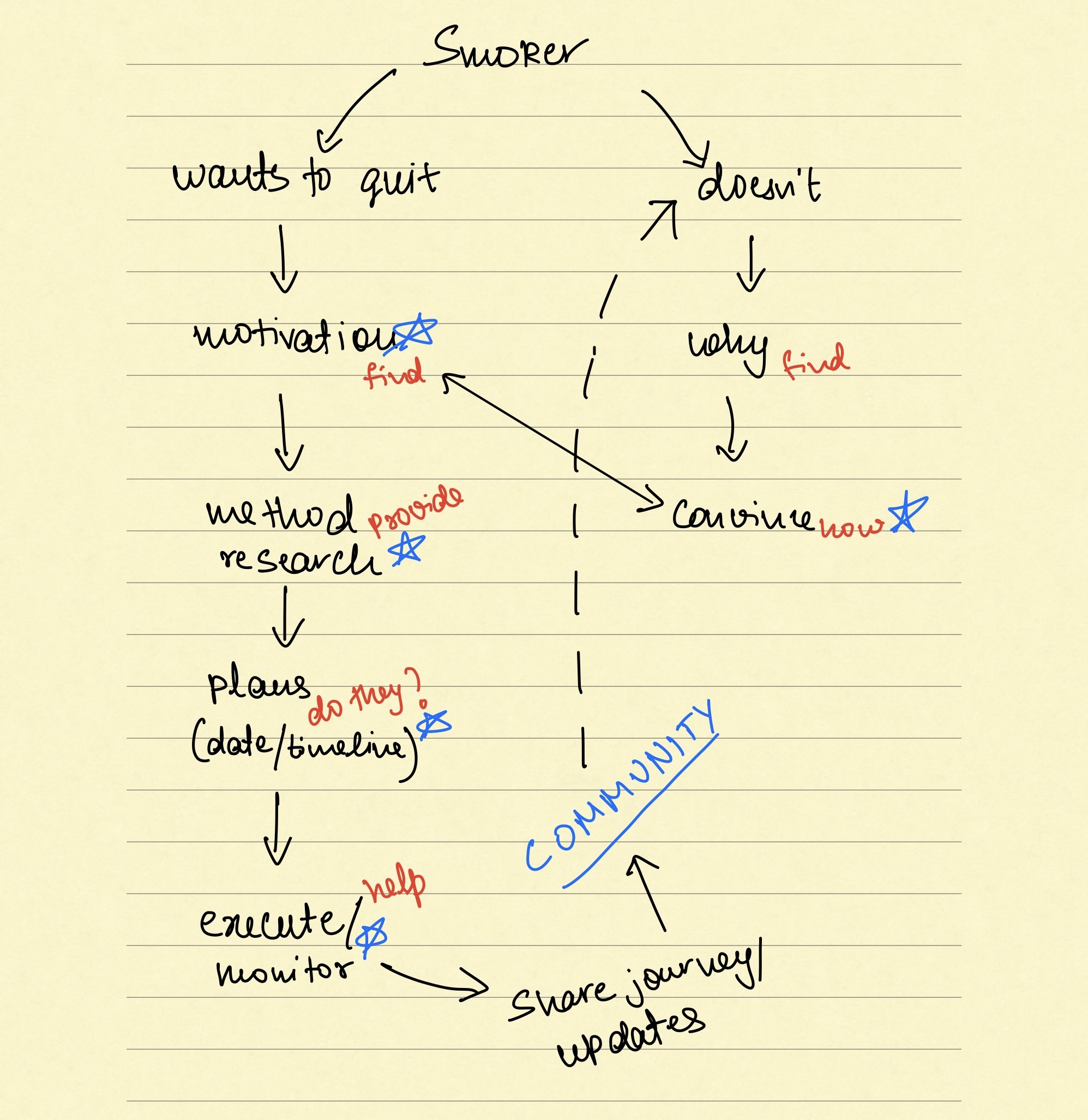
To understand the need for a dedicated quit-smoking app like "Quitogether," we followed a clear research direction:
Surveys > Contextual Inquiry > Competitor Analysis > Empathize.
We gathered insights through surveys, observed real-life contexts via inquiry, analyzed existing solutions, and ultimately empathized with users' challenges.
UNDERSTANDING THE QUIT SMOKING JOURNEY:
Our team sought insights into the quit-smoking experience from the user's viewpoint. We immersed ourselves in their challenges: using quit-smoking apps, health tracking, and exploring cessation forums. This provided valuable understanding of their needs and frustrations. We crafted and distributed surveys via smoke shops and forums.
CONTEXTUAL INQUIRY:
Follow-ups revealed quitting motivators—
health concerns and economic benefits and preferences for gamification and visual tracking, cautioning against guilt-inducing designs.
approach
From our individual projects, contextual inquiry, screener and interviews we encountered these findings:
SYNTHESIZing
PERSONAS

PERSONAS


IDEATION & Design decisions
INITIAL SKETCHES
ORIGINAL FLOW
A sample of our original flow.
TESTING & iteration
We tested our prototype throughout the design process with 10 people. From testing we uncovered these important points
Users did not want to log in as a requirement just to log and view habits.
Users wished their achievements showed up as badges in the community space.
We removed the login requirement from the very first screen and kept it only for community posts.
We also added badges to the profile pictures, which the user can pick from their achievements.
Much of our informational text was too small & unnecessary
Instructions & tracking needed to be one, simple experience that allowed users to check off their steps while following instructions.
- Nope, nope, nope. Too much text! The users did not find value in the information these screens provided. We removed these screens completely.
The Evolution of our splash screen.
Info we nixed.
Tools & Materials iterations
Displaying easily understood health metrics, such as "50% improvement in lung health," and focusing only on positive changes supports a trauma-informed design, fostering encouragement and a sense of achievement without overwhelming users.
Setting a tangible savings goal, like a TV, makes the reward concrete, boosting motivation and making the progress towards quitting smoking more rewarding and personalized.
Our achievements page rewards users for maintaining their streaks with fun names across different areas, creating a playful and encouraging environment that celebrates each milestone in the journey to quit smoking.
The community page facilitates story sharing, where users can proudly display badges next to their profile photos, chosen from their achievements page, fostering a sense of camaraderie and shared progress among members
Following instructions
We first wanted to give the users the option to check off every section of every step, however we failed to provide an overall progress indicator. (UI here is unrefined).
Users asked for a way to track their overall progress & combining the instructions with a progress checklist was the simplest way to do so.
solution
A smarter, supportive way to quit smoking
EXPANDING SCOPE & USER INSIGHTS
We plan to expand QuitTogether beyond cigarette smoking to include vaping and other addictive habits. Usability testing with diverse users will guide tailored support for each addiction.
EVOLVING UI DESIGN
With the expanded scope comes added complexity. We will update the UI to stay intuitive and purposeful, ensuring a seamless experience for all users.
next steps
Future work
reflections
LEARnings
This project has helped me gain a deeper understanding on how every detail of the design process greatly impacts the users experience. Dealing with a wide user base came with its own set of challenges as every design decision had to be made for a large group of users. Whether it's someone quitting smoking to improve their health or another person trying to save money by kicking the habit It was a big reminder of just how crucial it is to keep our users at the heart of our design, making sure we're really tuning in to what different people might need or want from our app.


.png)
.png)


